Serifs
For the past year, the serif typefaces I have used and liked were:
HAL Timezone
Timezone is a low-contrast, weighty serif typeface. It’s robust and has high visibility. It has slightly round edges. The Regular and Monospaced are sturdy and durable, while the Italic is more playful and dynamic, reminiscent of classical, antique serif faces.

With its ample x-height, this typeface has great readability when set small. The thick stroke weight conveys reliability and warmth. I like how the stem connects to the serif. The brackets are almost straight lines, which contrasts well with the slightly round edges, revealing the typeface’s unique personality.
I chose this typeface for the bell hooks text to convey elegance, strength, and durability.
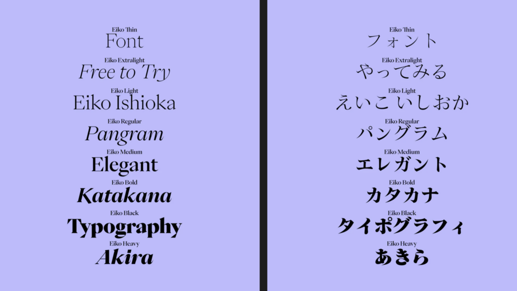
Pangram Pangram Eiko
Inspired by the work of Eiko Ishioka, a multitalented Japanese artist, it is an elegant typeface characterized by high contrast.
This typeface is very beautiful and elegant in display size while the delicate serifs limit readability when set small. I used it for quotes on the migratory data website. Its vertical stress provides visual stability, while sharp, angled serifs suggest directional movement—perfectly echoing the flight patterns of birds. The typeface’s distinctive features, like the square dot over the ‘i’ and the unadorned leg of the ‘k’, create a sophisticated, contemporary character that favors precision over warmth. These details, combined with its airy quality, make it an ideal choice for conveying both motion and refinement.
Immortal Infra
Immortel Infra finds its source in the work of Robert Granjon, a typeface engraver from the 16th century. It’s a dense old style typeface. The letters follow a pretty classic path, whereas the other elements (punctuation and mathematical symbols) have a slightly lighter color than the lower-case letters, which allows one to speak about, show, and subtly emphasize the signs which structure a phrase.
The capital letters are also slightly darker than usual in order to pursue this direction.

I chose this typeface because it has a times new roman bookish vibe for the running text. I chose this type because I thought doug scott might like it. It’s a bit plain for me. But the world heritage publication is not a case for something like Timezone. Timezone kind of has a narrative quality to it. This publication is more serious editorial. I did find the contrast between straight, clear, cuts and curve more interesting than other old style typefaces such as baskerville. The “f” definitely gives an old style, classic vibe.